LetsGetChecked health screening test results.
LetsGetChecked provides home lab test kits & healthcare solutions to monitor peoples health and help diagnose certain conditions both direct to consumer and business to business.
The Challenge
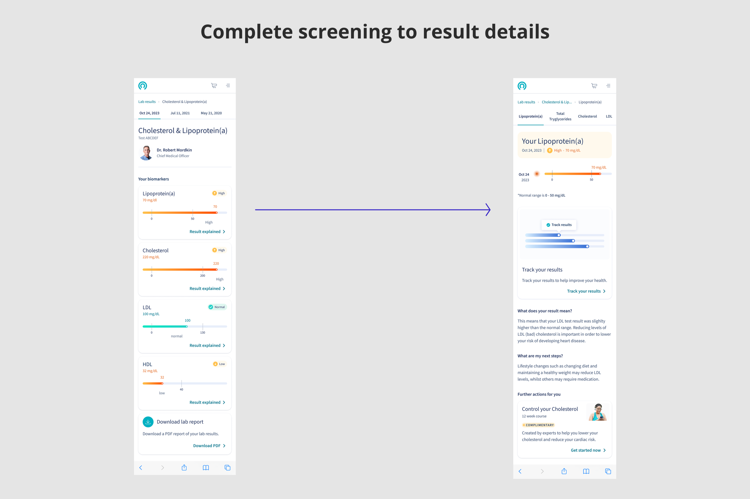
Once a patient has taken one of our health tests/screenings they recieve their results via our health dashboard. Health tests results are well known to be difficult to understand.
Research by the Journal of American Medical Association found that 61% of patients did not understand their medical test reports.
The challenge is to help patients easily understand their health results, to help them with next steps if they receive an abnormal test result.
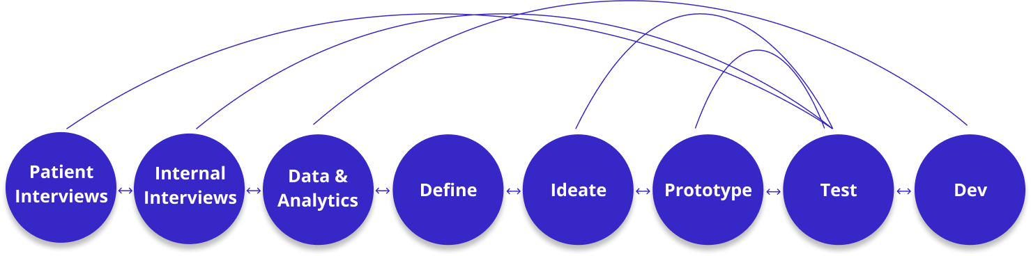
Process
To give patients health care test results and advice can be comlex and anxiety ridden for the patient. In health care it is important to get things right, a wrong diagnosis or miss understanding in what a result means can have big consequences.
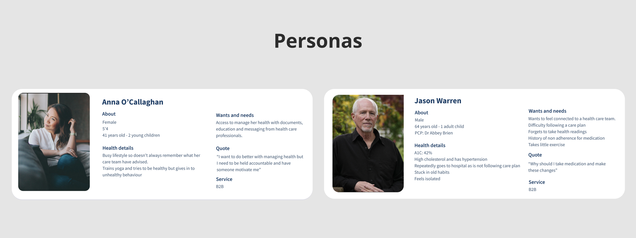
During my research I interviewedans user tested with patients, nurses, physicians and found some interesting results. Patients get overwhelmed with health information and complex results as it is an unfamilar space for a lot of people.
Through compiling all my research with user testing and I could create a design which worked well for our internal team and our patients which increased our patients understanding of the results and next steps.
The research
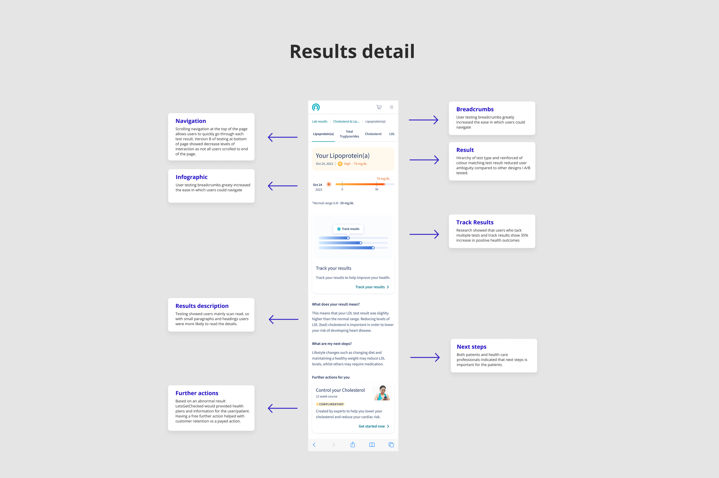
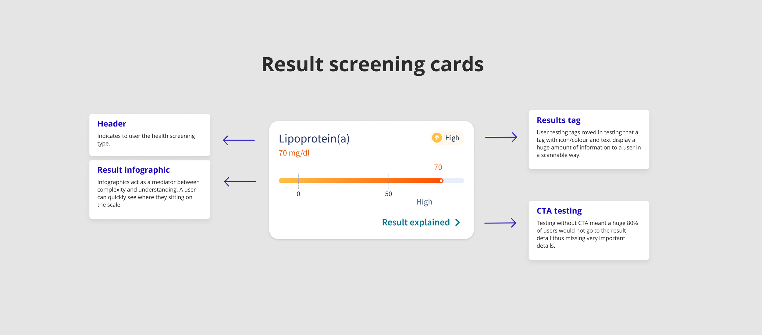
During patient interviews I found it was obvious that patients scan text, so based on this I made inforgraphics and paragraphs short and easy to read. Tags also reinforced the patients results that they could quickly scan.
I interviewed and held workshops with our internal nurse and physican team about what concerns and feeback they have when giving patients their results. Issues such as don’t make the patient worried with too much complex information and to create a very simple and understandable interface for our patients as to reduce the number of patients understanding the results and information incorrectly.
Each piece of information on the design was then user tested with strict internal reviews. The end result needed to display complex health results in a way for patiients to be able to understand it as they scan through their results.
The details
Every mirco detail of the design was important and I spend a lot of time reviewing and iterating on our result screening cards. Every detail on the card came out or research, usertesting and internal interviews with health professionals. For example I user tested the colour red when giving abnormal results (like some of our competitors do) but found that our patients became anxious and stressed. Changing the abnormal result colour from red to orange was enough for our patients to be less anxious but know they had an irrgular test result.
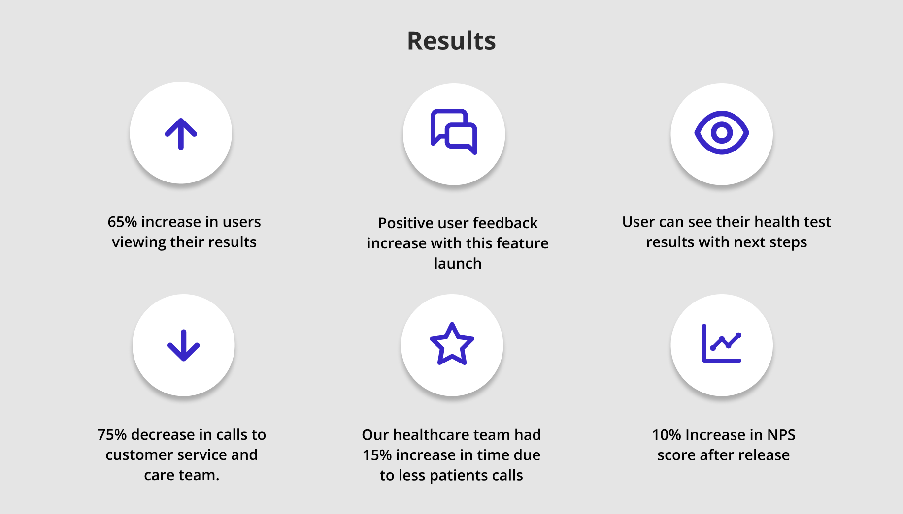
Results
The results and feedback we got after launch were immediate. We had less confused customers/patients call us and therefor our care team had more free time to spend on other important projects to help push our business forward. An imprtant metric was that our patients read and understood their results which our feedback indicated was a 65% increase.
In turn this feature helped increase our NPS score, increaed customer retention and helped us with our B2B sales.